Intro:
As a full service agency, we are asked this question a lot by our clients:
How can we display a lot of information in a visually engaging, accessible and widely appealing way?
Fortunately, there are a number of answers to this question and our Film, Words, Design and Campaigns teams are all up for the challenge. Our Film team are no strangers to a slick edit or a let’s-fight-the-elements shoot (jeans in the sea is never a good idea Simon) to get the perfect footage. And our Words team are well-versed – pun intended – in the world of educational and informative scripts or persuasive copy. But the focus of this case study is on our Design team and how illustration can be used to captivate your audience’s attention and create an instant connection.
At Idenna, we are lucky enough to have a fantastic Design team who can whip up a website or a digital brochure, but they are also talented illustrators.
Illustration in Marketing
As a marketing tool, to put it simply, illustration is more human. It is a great way to convey complicated information whilst helping to build a connection with your audience, and has proven to be more effective than words or logos at this as it shows more character and variety. It engages people more emotionally and is seen as a trust signal. It shows you are treating your audience as human beings, by providing a point of relatability and often evoking a sense of nostalgia. Who doesn’t love good illustration?!
So, whether it’s a custom map, infographic, or product illustration, incorporating illustrated visual elements in your next campaign will add a personal touch whilst being easily digestible.
Case Study:
The Brief:
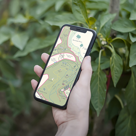
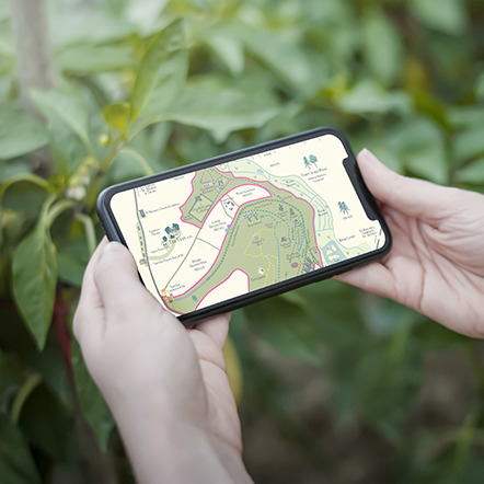
Redesign the site map for visitors to Caerhays Gardens. The map needs to be more accessible and to include the recent expansions of the estate and gardens.
The Caerhays Castle Garden is located just outside St Austell, overlooking Porthluney Cove and surrounded by woodland. It is famous for its champion magnolia trees and, over the past few years, has expanded with new paths and visitor attractions. To reflect these changes and provide visitors with an enhanced experience, the estate asked Idenna to redesign its site map.
Enter Kate, part of our wonderful Design team, who embarked on the journey to create a visually engaging and informative map that would connect with new and old visitors alike.
The Process:
Kate visited the estate to gain firsthand experience of the site. She spoke to Lucinda, who works at Caerhays, to get her input and walked the paths – taking photos and sketching along the way to get a full understanding of the area. These conversations and visits informed her design.
Her creative process began with updating the map’s colour palette to make sure that different footpaths and landmarks stood out clearly.
Armed with knowledge, inspiration, photos and her sketches, Kate then embarked on digitally sketching the map, paying close attention to detail. Every icon and visual element reflects the unique features of the estate and its surroundings. The images Kate produced tell a story, a visual narrative of the estate’s rich history and the surrounding nature.
The result was a beautiful map brimming with intricate details and vibrant colours that align with the estate’s branding whilst giving it a refreshed feel.
The Wrap:
The Caerhays map is a great example of illustration in marketing that is both educational and visual. It serves as an easily digestible navigation tool for visitors and a key part of the estate’s brand image. But, it is also a useful re-marketing tool and a souvenir for visitors.
As the estate evolves and expands, the map can be easily updated to reflect changes without the need for a complete redesign. It can also be repurposed for digital platforms and social media posts and Kate’s illustrative elements can be used in isolation in the future.
✅Visually engaging
✅Digestible
✅Accessable
The Caerhays map, featuring Kate’s illustrations, has developed from a simple navigational tool into an engaging storytelling medium.


